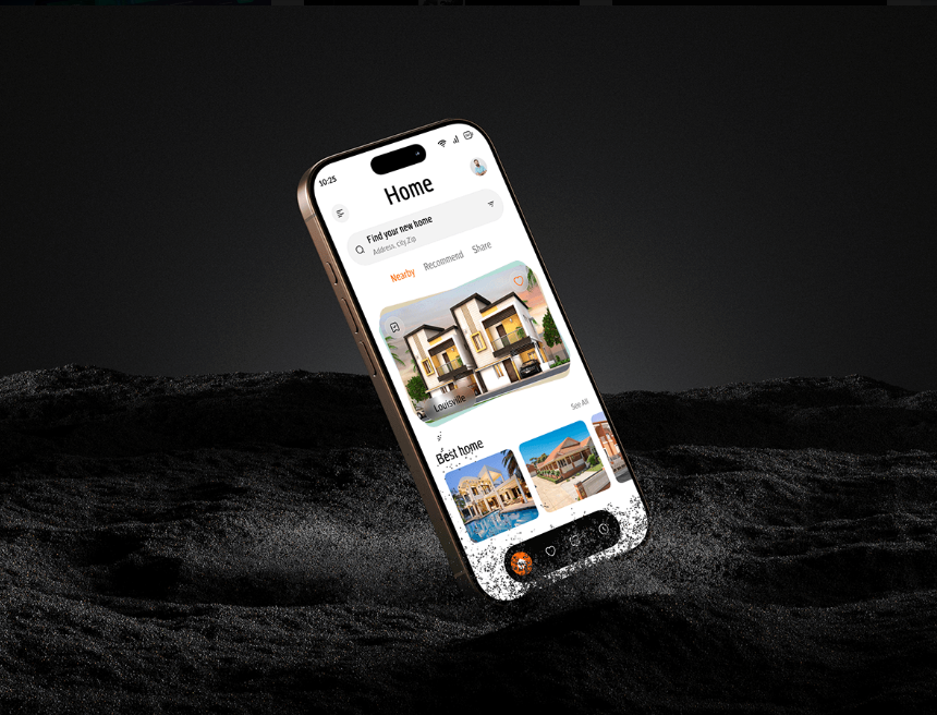
People are constantly using their phones, making it more important than ever to deliver an optimized mobile experience for your visitors. Kenke designs mobile websites that enhance your search engine rankings and create positive experiences for your users.
Responsive Web Design.
Say goodbye to sideways scrolling… FOREVER!
Does anyone even remember when websites were so wide they didn’t fit on a phone screen? We do, and we’re never going back! Kenke has been designing and developing mobile-optimized websites since smartphones first hit the market. With technology and users increasingly focused on mobile, we’ve made the mobile experience our priority. Your visitors will be delighted to access all your essential content with just a few clicks or swipes.
Don’t forget to show some love to laptops and tablets too.
Responsive Web Design for Desktop, Mobile, & Tablet
Responsive design goes beyond mobile websites. A truly responsive website adapts seamlessly to any device size, from wide desktop screens to laptops, tablets, and phones—with plenty of sizes in between. When Kenke’s expert team builds responsive websites, we ensure a positive user experience on any device or platform. This approach also benefits search engine ranking, as Google’s mobile-first indexing places extra importance on the architecture and design of new websites.